If you are on Google+, then the chances are you will have seen the news about the new G+.
Wait. What?
You can read the official announcement here.
What Google have done is build a new version of G+ from the ground up. It has material design oozing out of its pores and is quick and snappy to boot.
I waited to write this, because after a bumpy start Google rolled back the release of the new UI (User Interface). However…
Now when I log into Google+, I am presented with this.

It really is too tempting not to click let’s go, so I did. Besides, I wouldn’t be able to write about it otherwise.
When the screen refreshes you will immediately notice the material design. The familiar red colour scheme (matching the G+ logo) is there.
Now before I go on, it is important to note that the new UI is still in beta and you can switch back to the classic at any time. To do so, you should see a link in the bottom left of the screen (on desktop) like this.
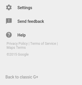
It’s fairly unobtrusive and pale, so you may miss it if you aren’t specifically looking for it.
That screenshot also shows another very important link, send feedback. As I said, the new UI is in beta and Google are encouraging users to use that link to send feedback on everything. If something doesn’t work? Send feedback. If there is something you cannot currently do in the new UI? Send feedback. If there is something you think is done better in the classic UI? You can guess the rest.
If for whatever reason you cannot see or click on the send feedback link, you can type an @ symbol outside of a text entry area to bring the feedback box into view.
So back to the new UI.
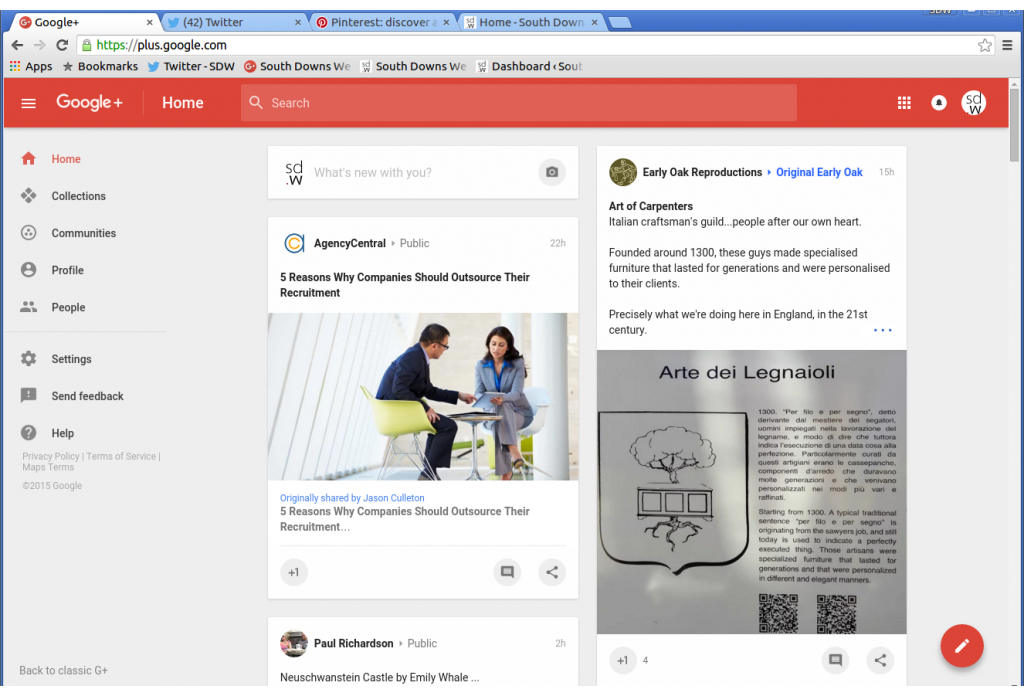
There are some nice animated effects in the new UI. For instance, clicking on one of the menu items causes the current page contents to quickly slide down out of view, to be replaced by the new page contents sliding up into view. It’s very smooth and slick.
Clicking on a post expands it to reveal more, while clicking on a comment pops up a context menu. That’s animated nicely too by the way.
There are two places you can start a post from. You can click in the space at the top of the home stream, which temptingly says “What’s new with you?” or you can click on the FAB (Floating Action Button) in the bottom right corner of the screen. The latter is handy, because it is always there. So even if you scroll down for days on end, you no longer need to scroll all the way back up to post. Just click the button and boom, done.
Sharing posts has been completely revamped. Now when you click on the share icon, a pop up appears giving you several options.
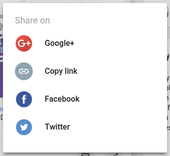
That’s right, you can now share Google+ posts you have created or curated, straight to Facebook and Twitter. For anything else there is the copy link option.
Google+ has for a long time been a great place for posting in depth content. With the ability to format posts and include interactive elements (Google Docs, Slides, Forms, Polls, etc.) you can effectively blog using it. Now with these sharing options it makes delivering your content outside of G+ that much easier. It also has the knock on effect that by encouraging people to share outside the network, it helps promote the network too.
Let’s take a closer look at the menu now, because there are some omissions that are a bone of contention for a lot of people.
- Home
- Collections
- Communities
- Profile
- People
- Circle streams
- Settings
- Feedback
Most of that you will be familiar with. Circle streams however, is slightly different. In the classic UI you could filter your stream by selecting one of your circles, which was accessible at the top of the page. Well it has moved to the menu on the left. Only 6 circles are currently available in the menu and to change them you will need to switch back to the old UI, drag your circles to where you want them and then switch back to the new UI.
That’s right, the new UI doesn’t have drag and drop yet for circles. It also doesn’t have a lot of other things. The ability to pin posts, or move them into and out of collections. That’s all missing. Hangouts and Photos are completely gone, although that may in part be due to them being separate web apps now. Pages appear to have been left out for the time being, which has caused a lot of angst among the G+ population. Profiles only have a subset of the information we are used to seeing. Events, polls, videos… the list of things that are removed or missing goes on.
That’s not to say they are gone for good. This is very clearly a beta product and Google have repeatedly said they want feedback.
So if the new UI is in beta and from the looks of it an early one, why have Google given the public access? Two reasons spring to mind.
- As I mentioned, they want feedback. As much as possible. Also there are some things which can only be discovered via a large scale deployment, so it was inevitable at some stage.
- Even though the new UI needs a lot of work, Google may have decided it was better to release it in public beta early, to show support for the platform.
Let’s think about that. We are all tired of hearing the same old Google+ ghost town stories and the rumours about Google+’s imminent demise. What better way to dispel those myths than by releasing a product that is a completely new reworking of the original? Especially if (as I suspect) Google release frequent updates to the new UI over the coming days and weeks. No one is going to say Google have plans to drop Google+. If they do they will be laughed right out of the building.
There is also a third reason which I think cannot go overlooked. I cast my gaze at all the other social networks in the great wide world and I see them tinkering. A lick of paint here and a touch of colour there, but nothing really changes. They are stagnating in a pool of old code and last decade’s designs. Can anyone say that Facebook looks new anymore? What about Twitter or LinkedIn? I am sure there will be users and share holders looking at those other networks and thinking, “Why aren’t we getting a new UI?”
