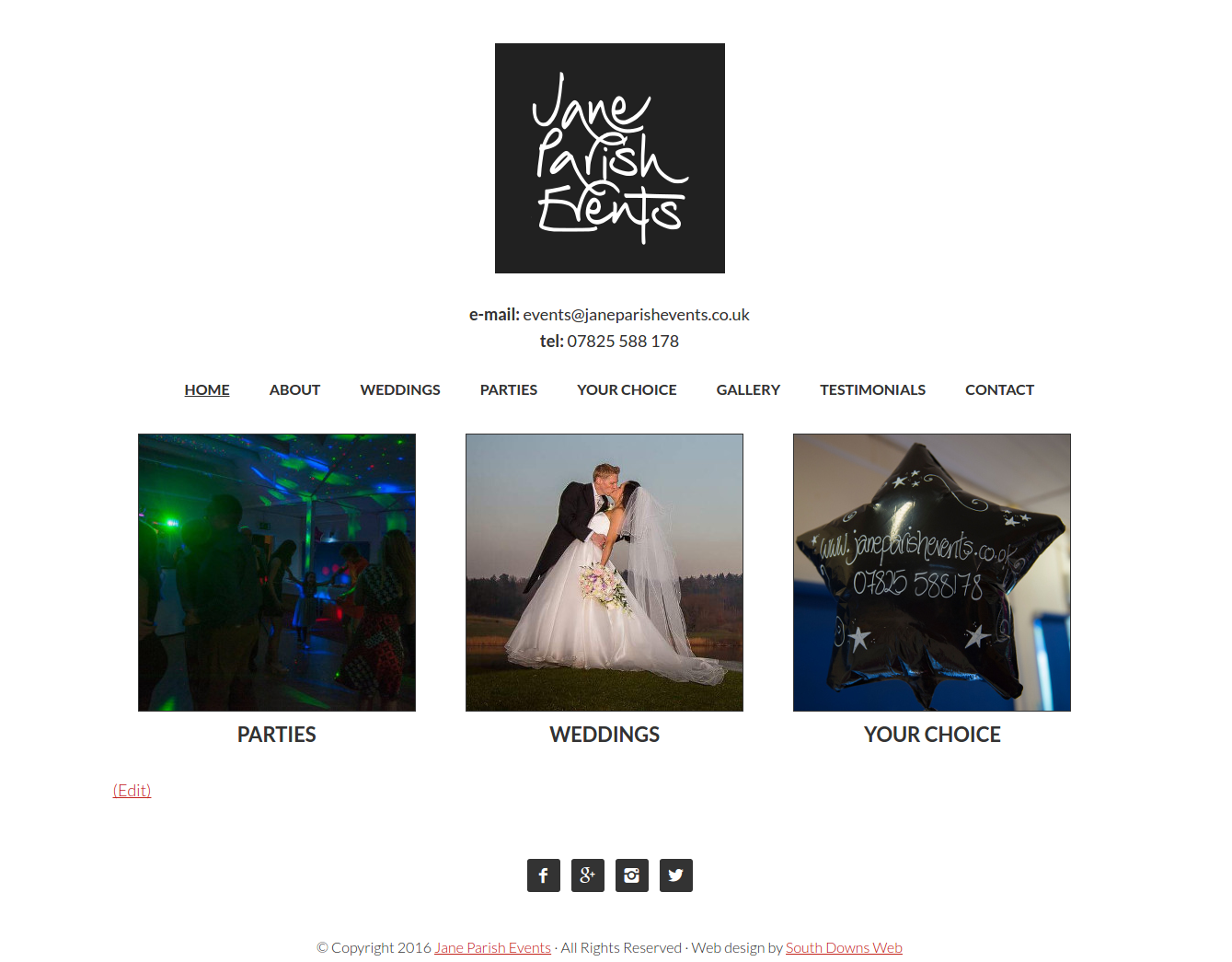
Jane Parish Events had a logo, but needed a website. So we made one to match the simplicity and style of their logo.
With any website it helps if you have access to a decent set of images that really stand out. The design doesn’t want to get in the way of that, but should enhance it. We even used some of the images as part of the site navigation, making it easy to switch between pages even on a small screen.
Anyway, I know where to go for the next big event that needs organising!
