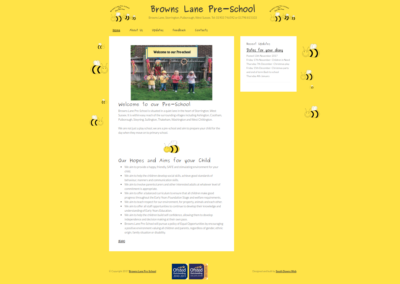
I have a soft spot for Browns Lane Pre-School. Not only was it the first website I ever did and got paid for, but my kids both went there when they were younger too. So when the owner came to me and asked if it could be updated, I was delighted.
The old site
Things change fast in web development and also you learn a lot as time goes on. That first website looked okay and it had some funky little bees that flapped their wings when you moved the mouse over them, but it was mostly a static website. I built it with my own CMS (Content Management System), which wasn’t very advanced (it was my first attempt!). The biggest drawback however, was that the site itself wasn’t responsive. Meaning it looked teeny weeny tiny on a mobile device.
The new site
Out with the old and in with the new. I ditched my own CMS and decided to go with WordPress and build a theme based around the Genesis framework. WordPress and Genesis together are very flexible, so I was able to build the site quickly to the specification set out. The owner liked the look of the old site, so the basic design matches it as closely as possible. There are some differences though.
Firstly, those bees that flap look good at any resolution. Rather than doing a straightforward copy of the original bees and accompanying script, I recreated both. The bees are now SVG files, so they scale seemlessly at any size. That meant I didn’t need to use as many image files, which had the knock on effect that the script I wrote to animate the bees is now roughly a third of the size of the original. In other words, the bees load faster and look better than before.
The really big difference is that the site now looks good on different screen sizes. No more zooming in and out to read things. Oh and importantly the pre-school can now edit everything on the fly.
